


Description
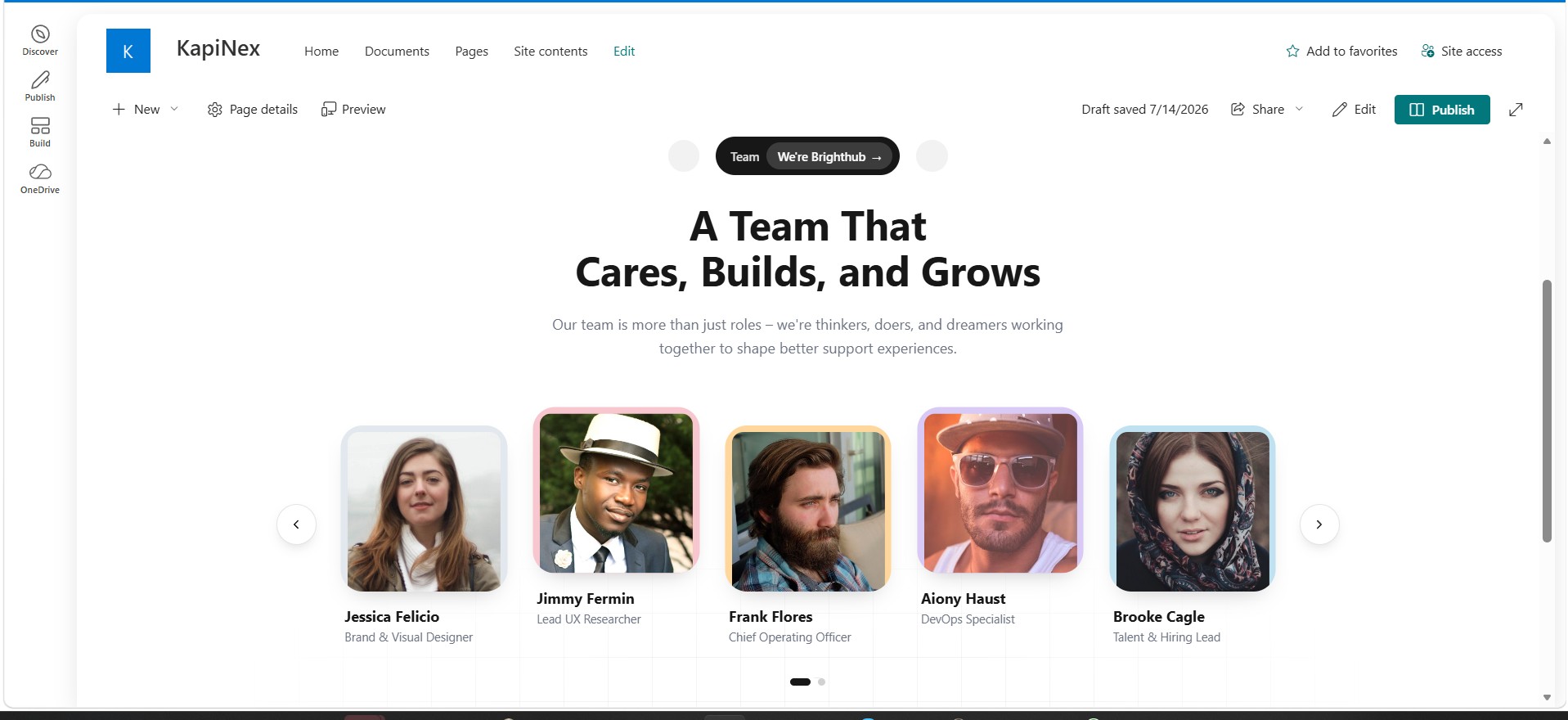
Team Carousel is a SharePoint Framework (SPFx) web part that displays your team or staff directory as a responsive, animated carousel of photo cards. Every piece of content – header copy, team member roster, brand colors, and carousel behavior – is configurable from the web part’s property pane, with no code changes required.
Features of Team Carousel webpart
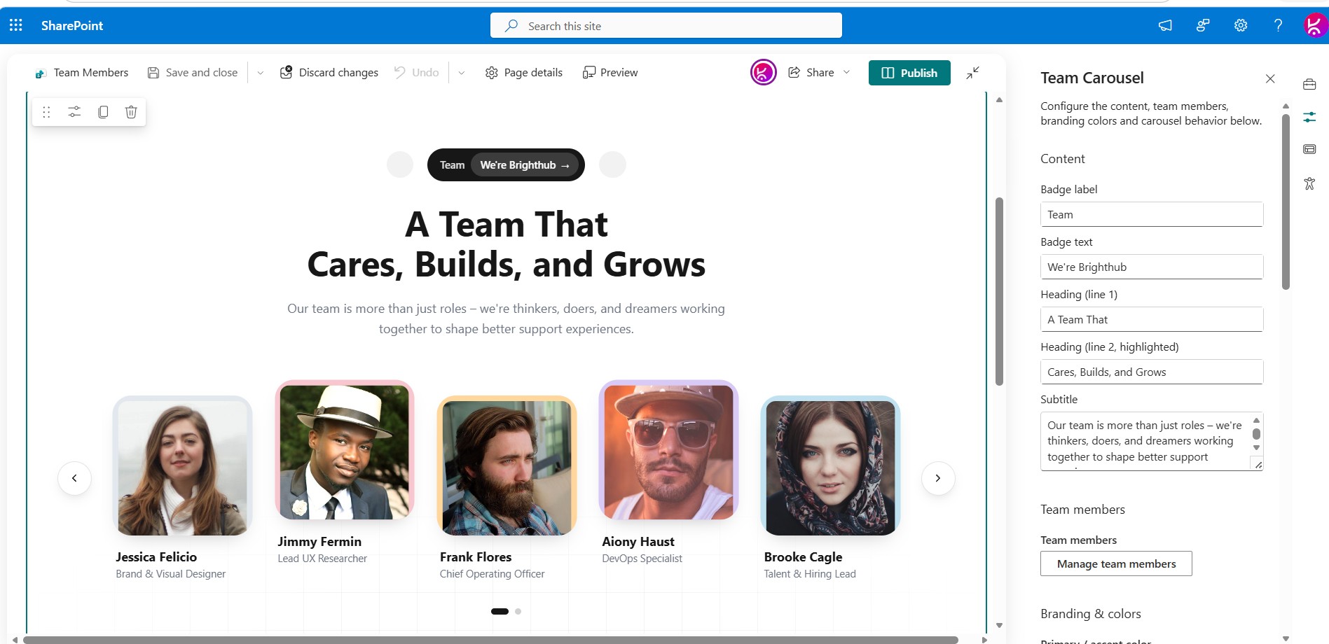
Fully configurable header content
- Badge label and badge text (e.g. “Team” / “We’re Brighthub”)
- Two-line heading, with the second line rendered in the accent color
- Subtitle paragraph
Team member management – no code required
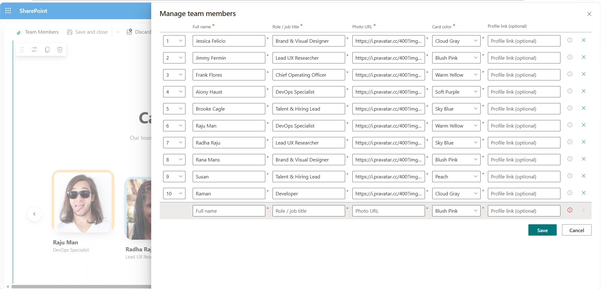
Manage the entire roster from a single **Manage team members** panel in the property pane. For each member you can set:
– Full name
– Role / job title
– Photo URL
– Card accent color (choose from a curated palette)
– An optional **profile link** — if set, the member’s card becomes clickable and opens the link in a new tab (e.g. link out to a bio page, LinkedIn profile, or Teams profile card)
Members can be added, removed, and reordered directly in the panel — the carousel picks up the changes immediately.
Full branding control
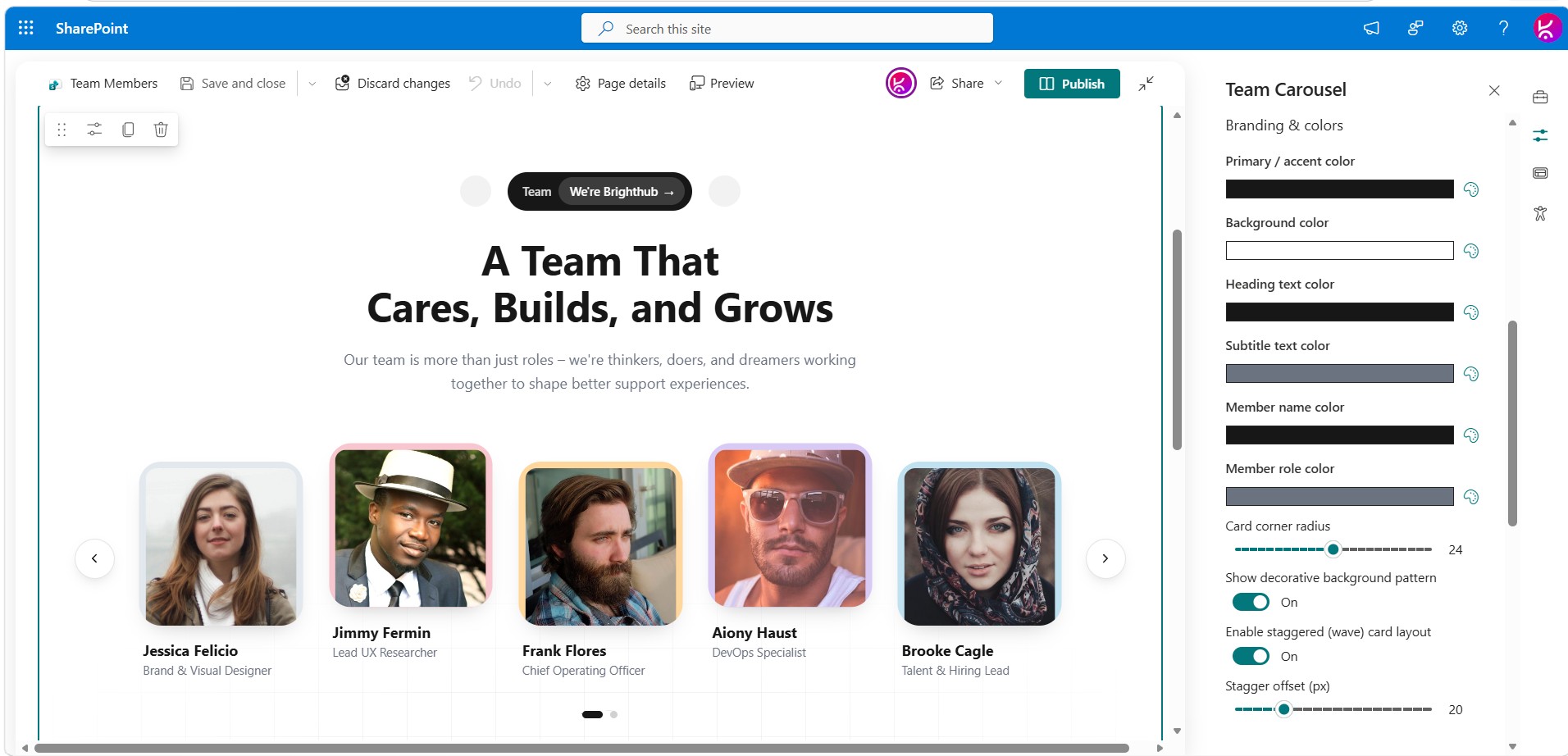
- Primary/accent color (drives the badge background, heading highlight, and hover states)
- Background color
- Independent text colors for the heading, subtitle, member name, and member role
- Card corner radius
- Toggle for a subtle decorative background grid
- Toggle + adjustable offset for a staggered “wave” card layout (alternating cards sit higher/lower, matching the reference design)
Responsive, animated carousel
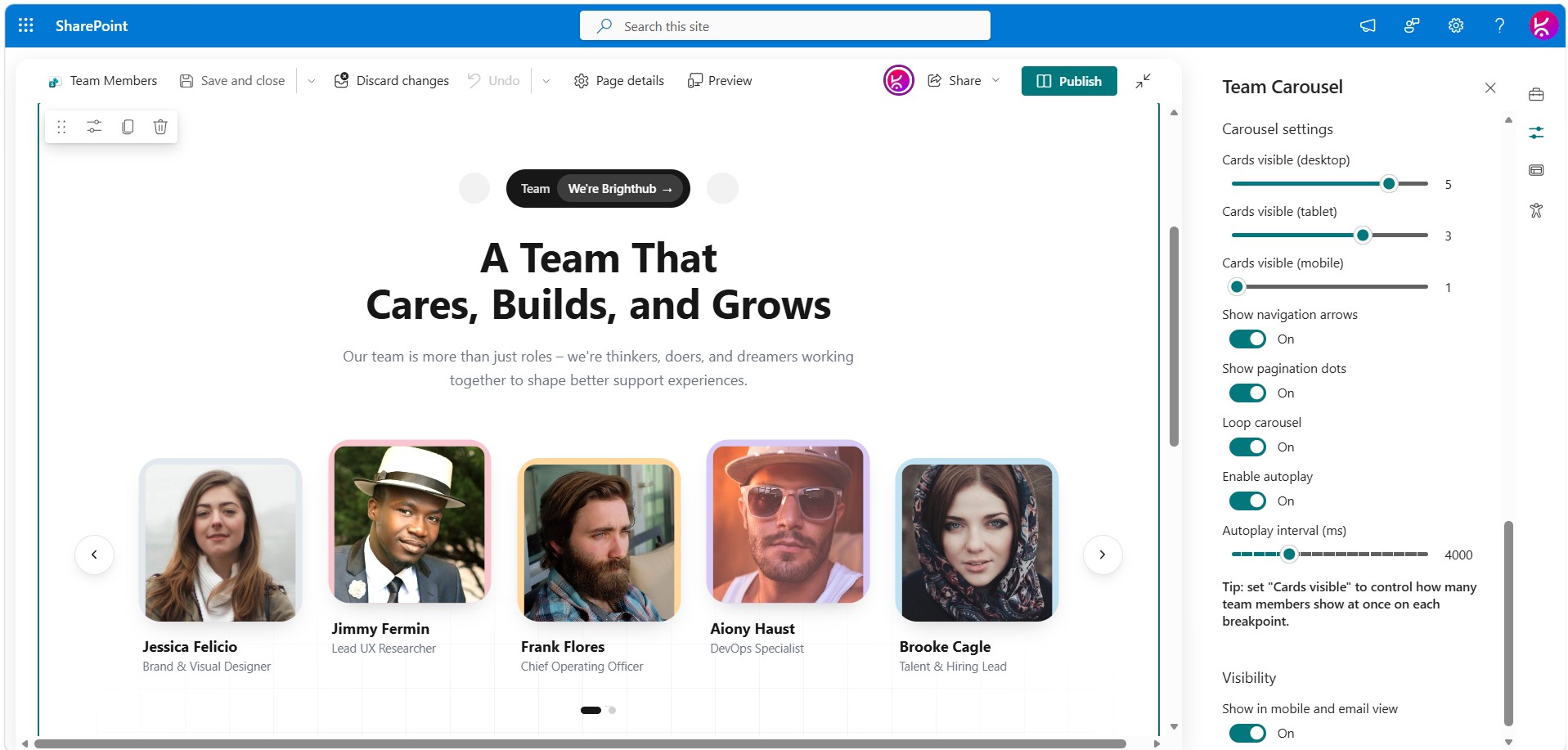
- Independently configurable number of visible cards for desktop, tablet, and mobile breakpoints
- Optional autoplay with a configurable interval, which pauses automatically while the pointer is hovering the carousel
- Previous/next navigation arrows and pagination dots (each independently toggleable)
- Seamless infinite looping: when looping is enabled, the carousel always continues sliding in one direction (left-to-right on “next”) instead of snapping backwards when it wraps from the last page to the first
- Layout re-measures itself automatically on container resize and when the browser tab regains visibility, so the carousel doesn’t get stuck after switching tabs/apps and back
Built for reliability
- Guards against overlapping/rapid navigation triggers (e.g. bursts of autoplay ticks) so the carousel can never scroll itself out of view
- Self-healing: if the carousel’s internal position ever ends up out of range, it silently corrects itself on the next render
- No external runtime dependencies beyond React and Fluent UI — team member photos are loaded directly from the URLs you provide (e.g. a SharePoint asset library, an O365 photo endpoint, or any public image URL)

 Configuring the web part
Open the page in edit mode, select the web part, and use the property pane (grouped into four sections):
| Group | What you can configure |
| — | — |
| **Content** | Badge label/text, heading line 1, heading line 2 (highlighted), subtitle |
| **Team members** | Add/edit/remove/reorder members: name, role, photo URL, card color, optional profile link |
| **Branding & colors** | Primary/accent color, background color, heading/subtitle/name/role text colors, card corner radius, decorative background toggle, staggered layout toggle + offset |
| **Carousel settings** | Cards visible per breakpoint (desktop/tablet/mobile), arrows, dots, loop, autoplay, autoplay interval |
Note: Full-width sections are a standard SharePoint limitation. They are natively supported only on Communication Sites and are not available on Team Sites. This applies to all web parts, including Microsoft’s out-of-the-box web parts and custom-developed ones.
If you are using a Team Site and need a full-width layout, you can download and install our FullWidth extension from here.




There are no reviews yet.