


Description
SharePoint Custom Header & Navigation SPFx webpart features
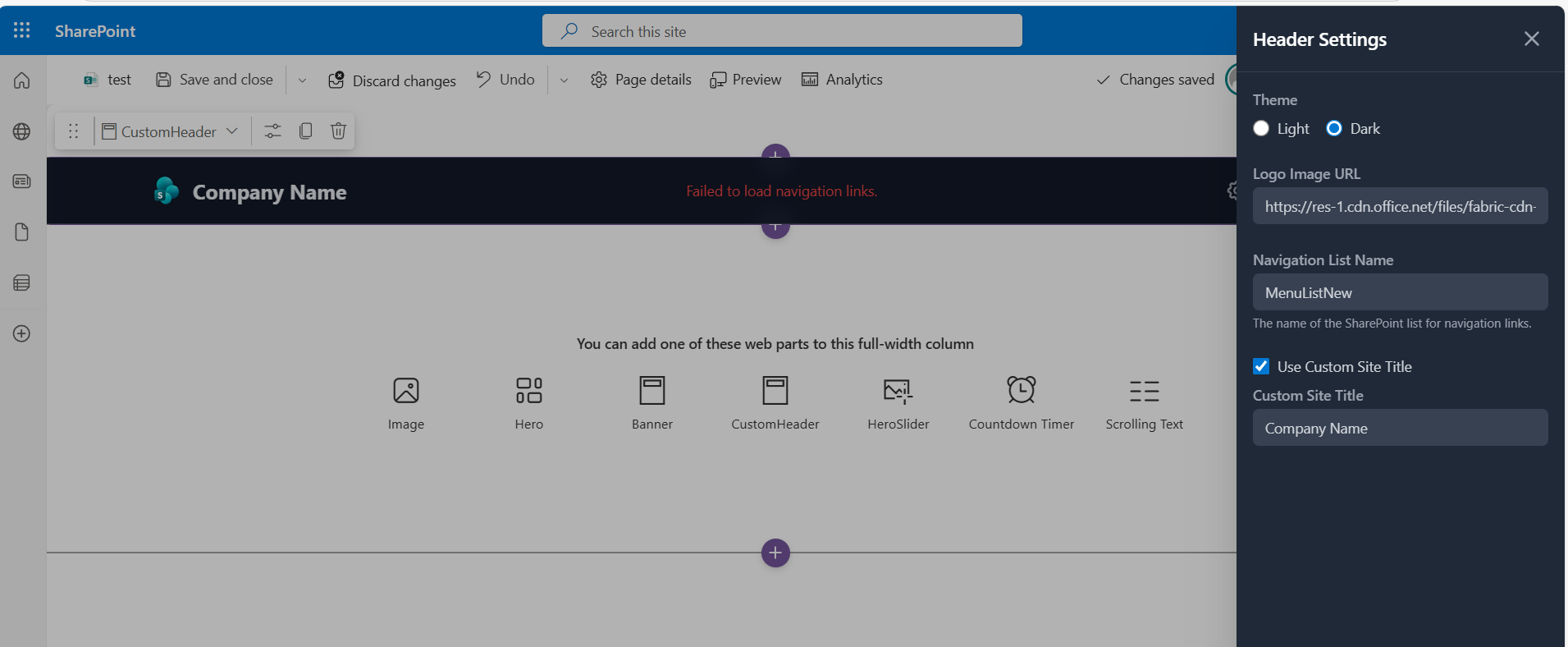
This web part provides a customizable header with several features:
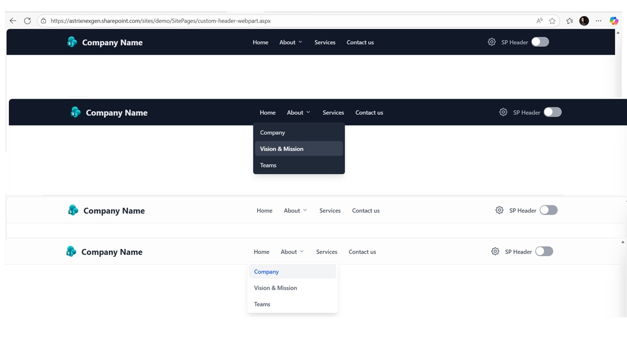
- Customizable Navigation: Fetches navigation links from a specified SharePoint list.
- Custom Logo: Allows setting a custom image URL for the header logo.
- Theme Support: Offers both ‘light’ and ‘dark’ theme options for the header’s appearance.
- Custom Site Title: Users can choose to display a custom title, which is configurable and can replace the default site title.
- SharePoint Header Visibility Toggle: Includes a toggle to show or hide the default SharePoint header.
- Property Pane Configuration: All these settings (list name, logo URL, theme, custom title options) are manageable through the web part’s property pane.
- Mobile Responsiveness: Features a responsive design with a mobile menu for navigation on smaller screens.
- Permissions-based Settings: The settings pane is only accessible to users with edit permissions on the configured navigation list.
SharePoint List Column Details
To build the navigation, you’ll need a SharePoint list with the following columns:
Title (Single line of text): The display text for the navigation link.
URL (Hyperlink or Picture): The destination URL for the link.
Parent (Lookup): A lookup field pointing to the same list (self-lookup). This creates the parent-child hierarchy for submenus. Leave this empty for top-level links.
DisplayOrder (Number): A number to control the sorting of links at the same level.


There are no reviews yet.