

Description
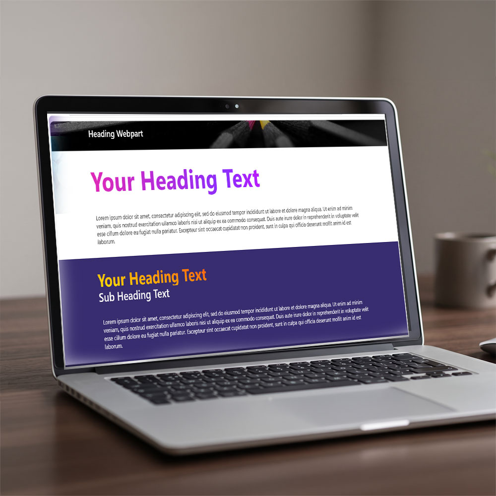
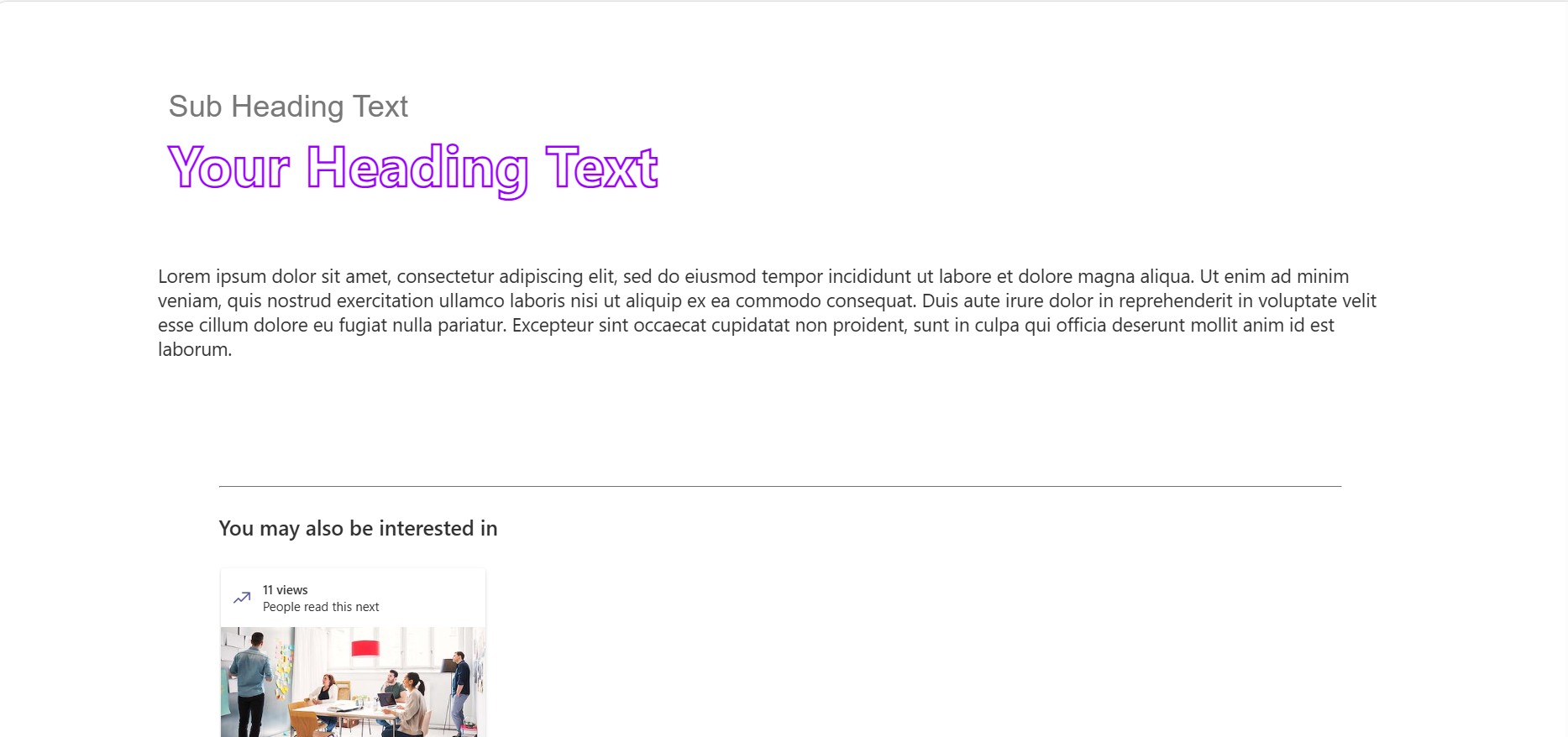
Heading Text Creator is a SharePoint Framework (SPFx) web part that replaces the plain, one-size-fits-all SharePoint heading with a fully styled, fully responsive text component. Instead of fighting the native property pane, editors get a large, tabbed style panel with a live WYSIWYG preview — so every gradient, shadow, and animation shows up on the real page as it’s being built, not in a separate preview pane.
It’s built for communicators, intranet teams, and marketing pages inside Microsoft 365 who want headlines that don’t look like default SharePoint — hero banners, campaign pages, landing sections, and announcement headers.
Compatibility: SharePoint Online (SPFx 1.20) · Modern pages · Communication & Team sites
Key Features
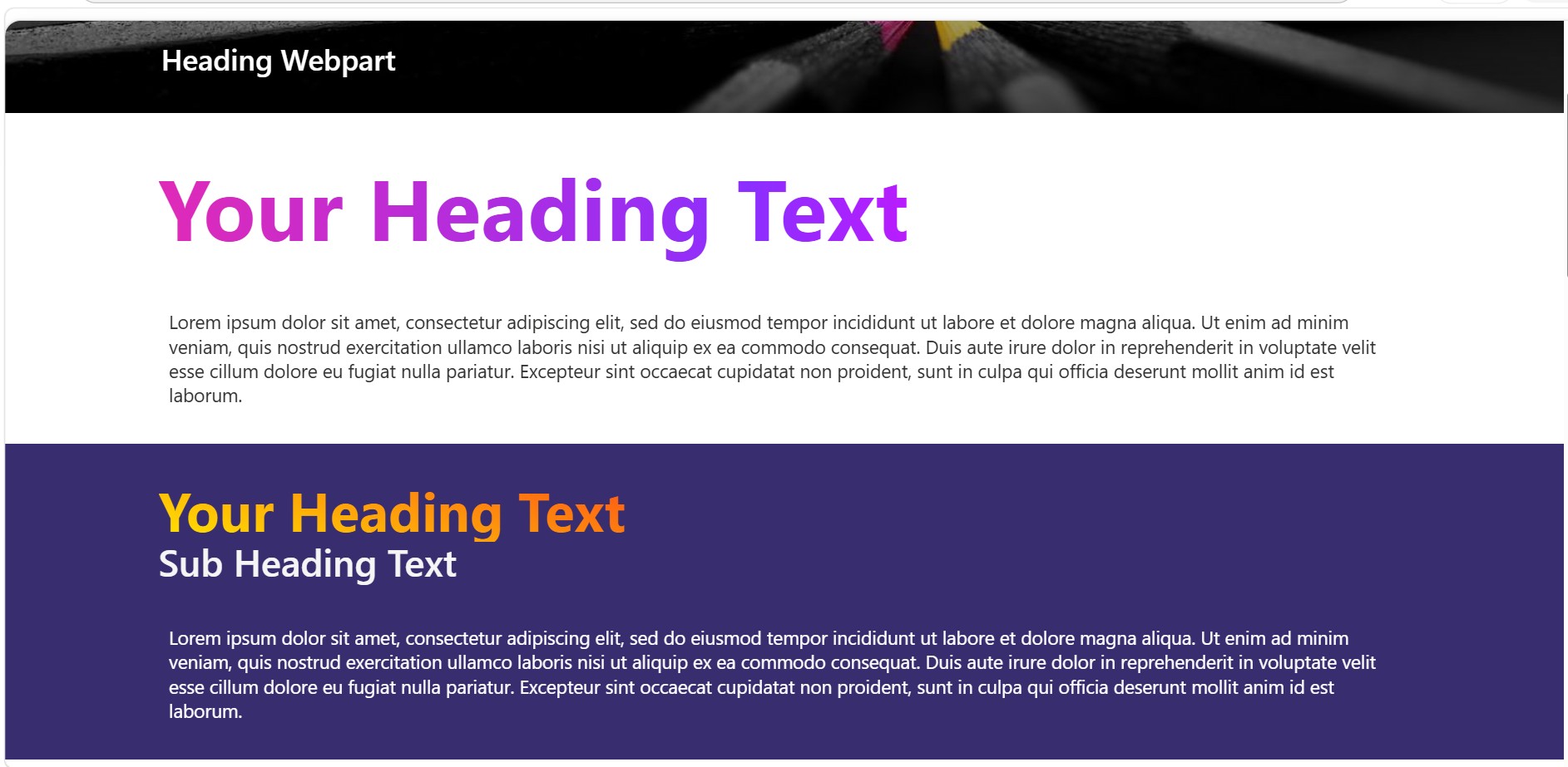
Gradient & Rich Text Styling
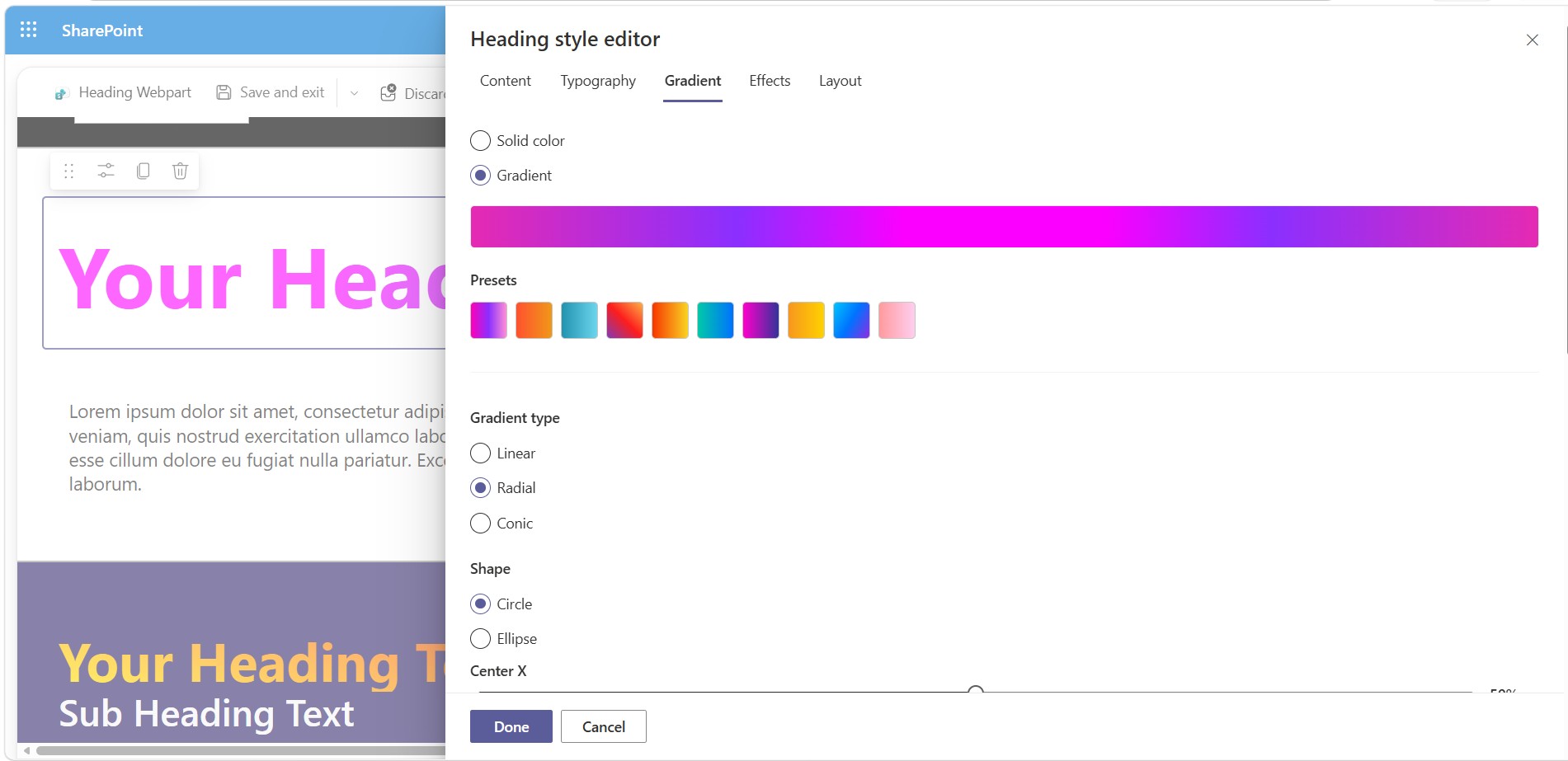
- Solid or gradient fill per heading line — linear, radial, or conic gradients with a draggable 0–360° angle dial
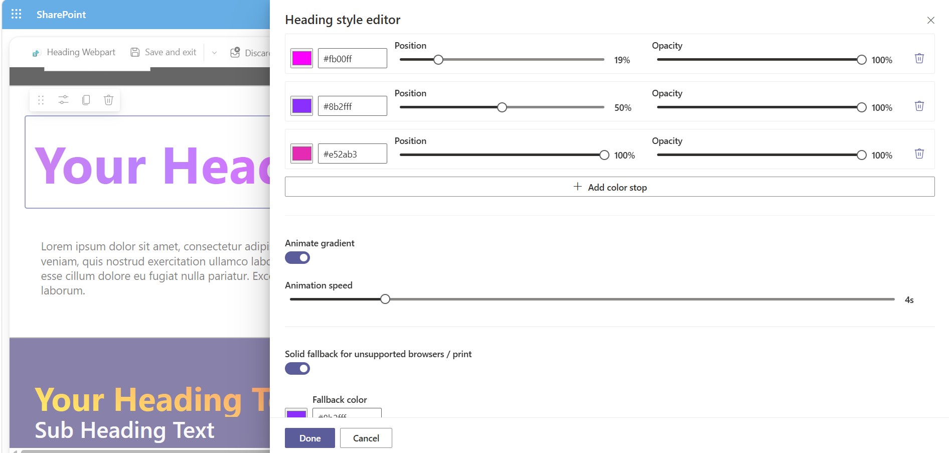
- Unlimited color stops, each with independent position and opacity
- 10 built-in gradient presets (Sunset, Ocean, Instagram, Fire, Cosmic Fusion, Northern Lights, and more)
- Subtle animated gradient shift, with a speed control — automatically disabled for visitors who’ve requested reduced motion
- Automatic solid-color fallback for browsers and print contexts that don’t support clipped gradient text
Full Typography Control
- Font family from a curated web-safe list, curated Google Fonts, or a custom stylesheet URL
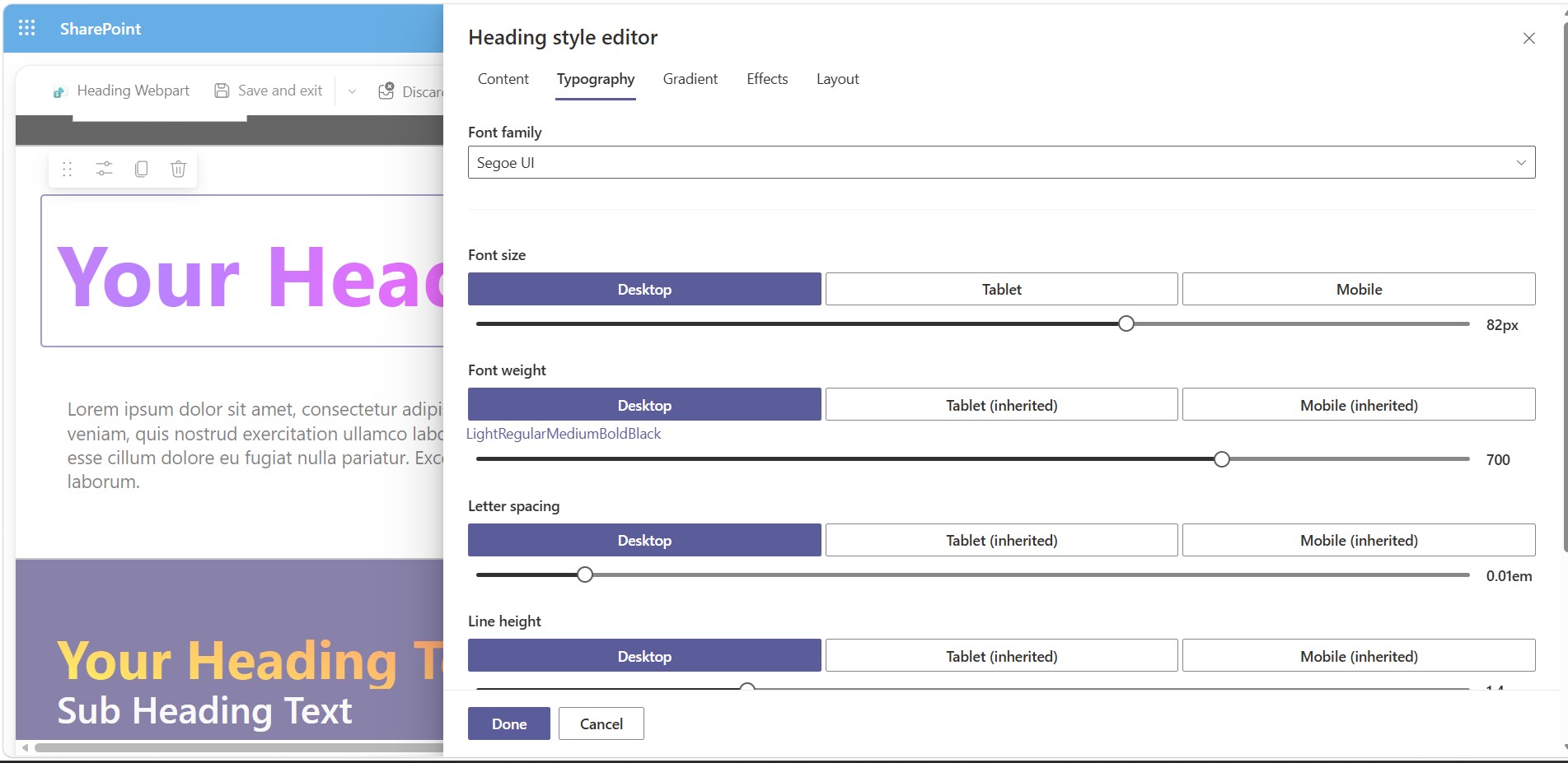
- Font size, weight, letter spacing, and line height — each independently responsive across desktop, tablet, and mobile
- Smart breakpoint inheritance: leave tablet or mobile unset and it falls back to the next size up automatically
- Per-breakpoint text alignment (left / center / right / justify)
Text Effects
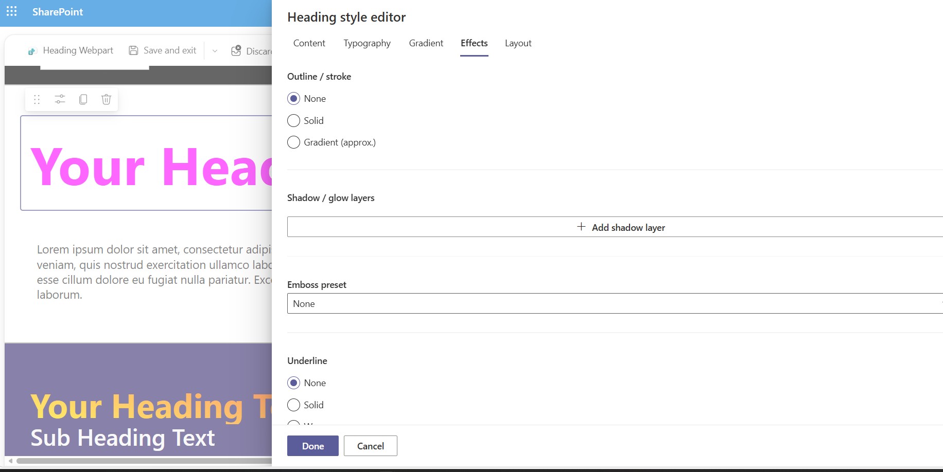
- Outline/stroke, including an approximated gradient stroke
- Layered shadow, glow, and neon effects (stacked, independently configurable)
- Emboss presets: Raised, Inset, Chiseled
- Underline styles: solid, wavy, or gradient bar
- Entrance animations: fade, slide, typewriter, and reveal-on-scroll — all respecting
prefers-reduced-motion
Layout & Container
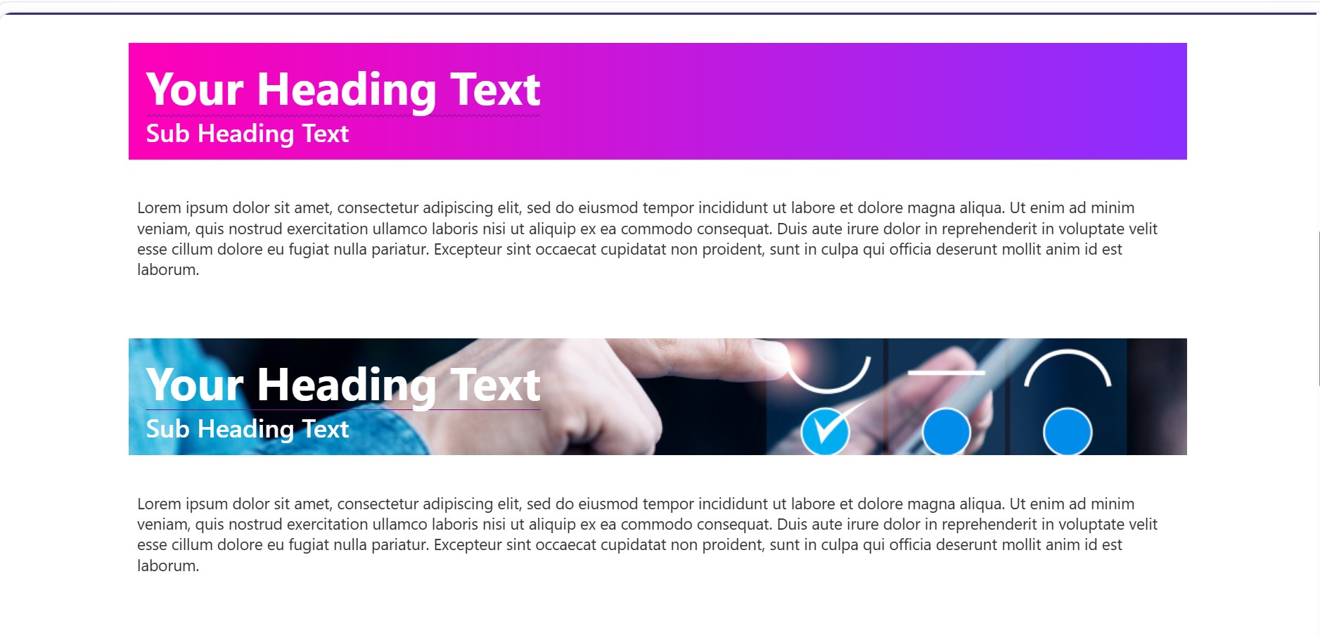
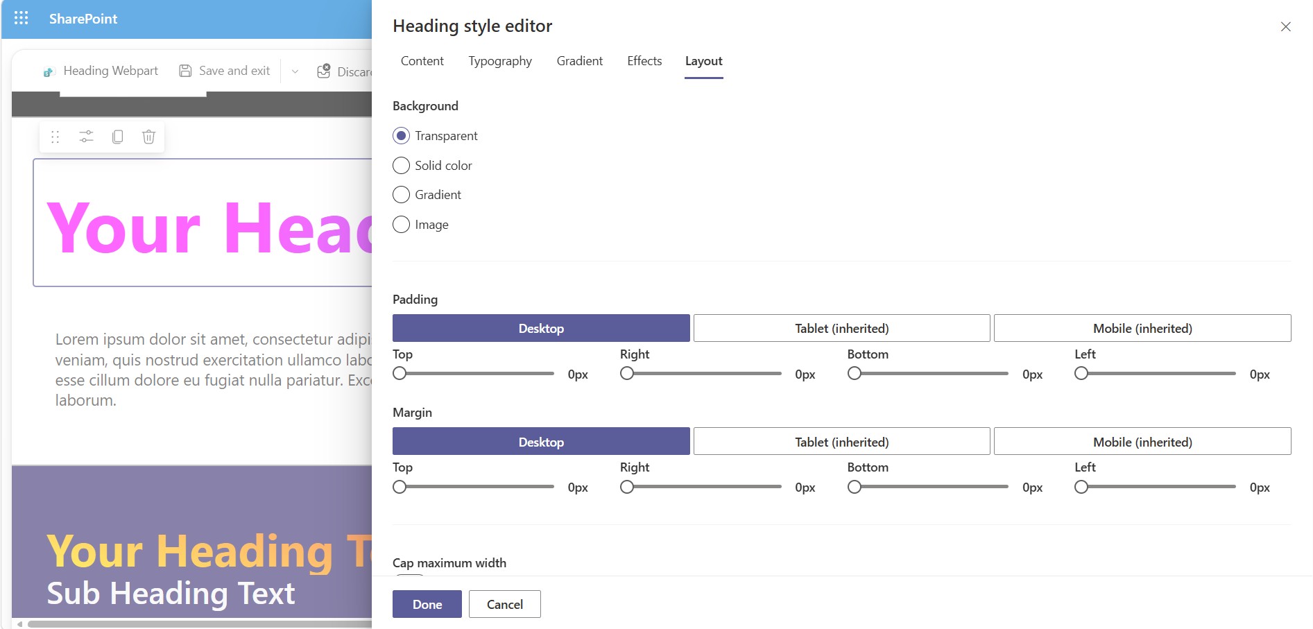
- Background: transparent, solid, gradient, or image (cover/contain/auto)
- Independently responsive padding and margin, per side, per breakpoint
- Optional max-width cap
- Wrap normally or truncate to a single line with ellipsis
- Optional link wrapper with safe defaults (
noopener noreferrerauto-applied on new-tab links)
Multi-Line Headings
Add multiple independent heading lines to a single web part instance — each with its own HTML tag (H1–H6), text, font, color, and effects. Useful for stacked headlines like an eyebrow label + main title + subtitle, without adding three separate web parts.
Editor Experience
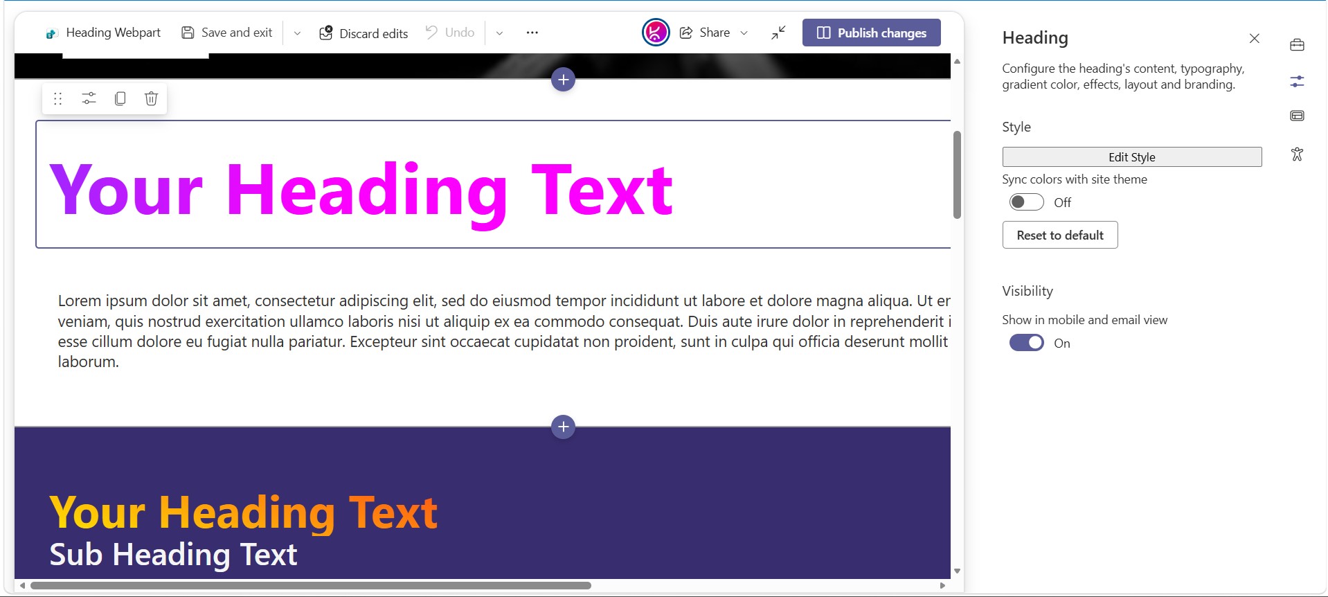
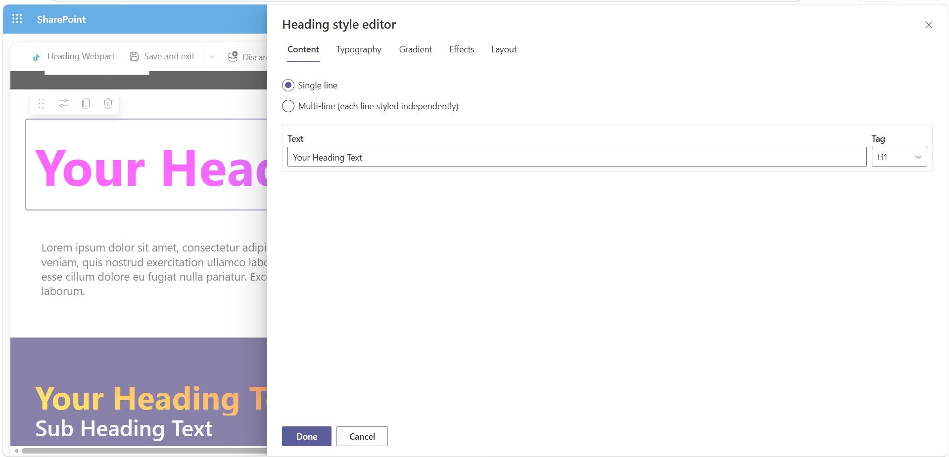
- One button in the native property pane — Edit Style — opens the full tabbed panel (Content / Typography / Gradient / Effects / Layout)
- Live WYSIWYG: every change applies to the real web part instantly
- Cancel reverts to the exact state before the panel opened; Done keeps changes
- One-click Reset to default
How to Configure
- Add the web part. Open a modern SharePoint page, click + to add a web part, and search for Heading.
- Open the style editor. Select the web part, open the property pane, and click Edit Style.
- Set your content. In the Content tab, choose single or multi-line mode, enter your text, and pick the correct heading tag (H1–H6) for SEO/accessibility — not just visual size.
- Style the text. Switch to Typography to set font, size, weight, and alignment per breakpoint; switch to Gradient to apply a solid or gradient fill; switch to Effects to add shadows, outlines, underlines, or entrance animations.
- Style the container. In Layout, set background, padding/margin, max-width, wrap behavior, and — optionally — make the whole heading a clickable link.
- Save your work. Click Done to keep changes, or Cancel to discard everything back to how it looked when you opened the panel.
- Publish the page. The style is stored with the web part instance, so it renders identically for every visitor — no extra CSS files or scripts to manage.
Tip for multi-line headings: once you’re in multi-line mode, each tab shows a line picker at the top — select the line you’re editing before changing typography, gradient, or effects, since those settings apply per line.
Note: Full-width sections are a standard SharePoint limitation. They are natively supported only on Communication Sites and are not available on Team Sites. This applies to all web parts, including Microsoft’s out-of-the-box web parts and custom-developed ones.
If you are using a Team Site and need a full-width layout, you can download and install our FullWidth extension from here.
Technical Specs
| Platform | SharePoint Framework (SPFx) 1.20 |
| Hosting | SharePoint Online, modern pages |
| Bundle size (page visitor) | ~27KB minified (editor panel is lazy-loaded, never shipped to visitors) |
| Accessibility | Semantic H1–H6 tags, reduced-motion support on all animations |
| Performance | Deduped Google Font loading — no duplicate <link> tags across multiple instances on one page |
| Browser fallback | Automatic solid-color fallback for non-gradient-capable renderers (e.g. print) |




There are no reviews yet.