

Description
Fullwidth Slider – SharePoint Web Part Features
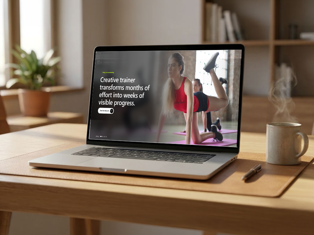
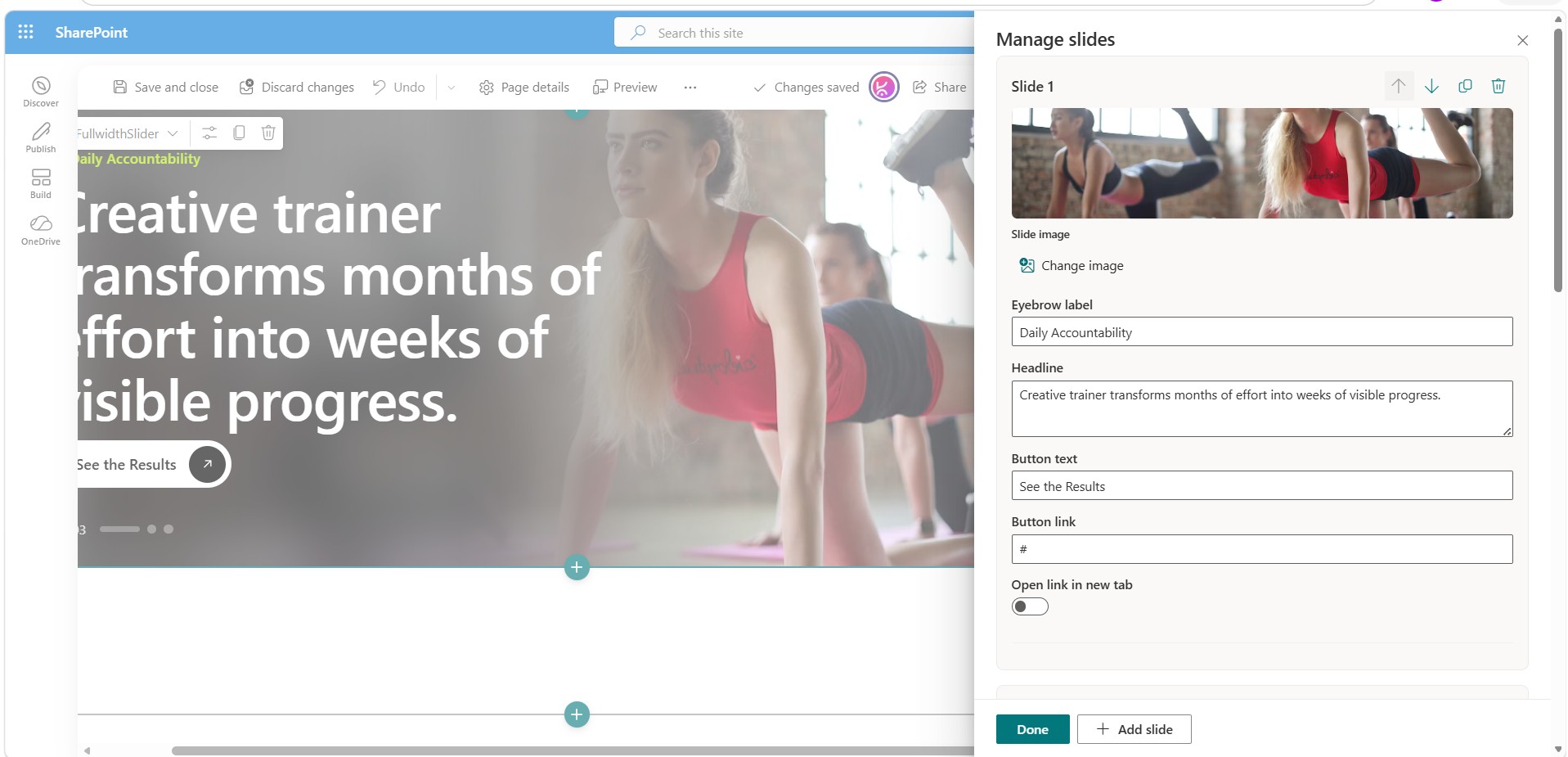
A full-bleed, hero-style content slider built for modern SharePoint pages. Content editors manage every slide directly from the page — no lists, no separate admin screens, no code — while site owners keep full control of layout, typography, and brand colors from the standard web part property pane.
Key Features
Content Managed Entirely from the Front End
- Multiple slides — each slide includes an image, an eyebrow label, a headline, and a call-to-action button (with custom text, link, and open-in-new-tab option).
- Manage Slides panel — appears only in page edit mode. Add, duplicate, reorder, or delete slides, and edit every field from a single panel.
- Inline click-to-edit — edit the eyebrow label and headline directly on the slide by clicking and typing, without opening the panel.
- Smart image picker — go beyond a plain URL box:
- Upload directly from your PC (auto-saved to the site’s SiteAssets library)
- Browse the current site’s document libraries
- Browse the Organization Assets Library (tenant brand library), if configured
- Pick from recent files across the tenant
- Paste an external image link as a fallback
- Empty state handling — if all slides are removed, an “Add slide” prompt appears in edit mode instead of a broken layout.
Layout & Behavior Settings
| Setting | Options | Default |
|---|---|---|
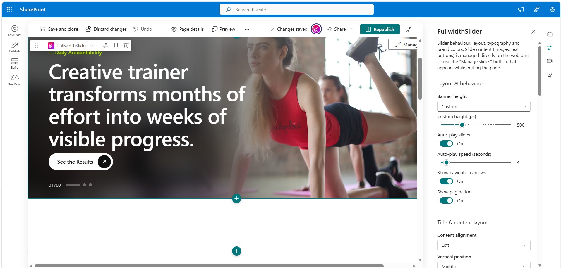
| Banner height | Small (420px) / Medium (580px) / Large (760px) / Full viewport / Custom | Medium |
| Custom height | 280–1000px (when height is set to Custom) | 580px |
| Auto-play slides | On / Off | On |
| Auto-play speed | 3–15 seconds | 6s |
| Navigation arrows | On / Off (shown on hover) | On |
| Pagination | On / Off — counter, animated progress bar, clickable dots | On |
Title & Content Layout Settings
| Setting | Options | Default |
|---|---|---|
| Content alignment | Left / Center / Right (mirrors background blur/scrim) | Left |
| Vertical position | Top / Middle / Bottom | Middle |
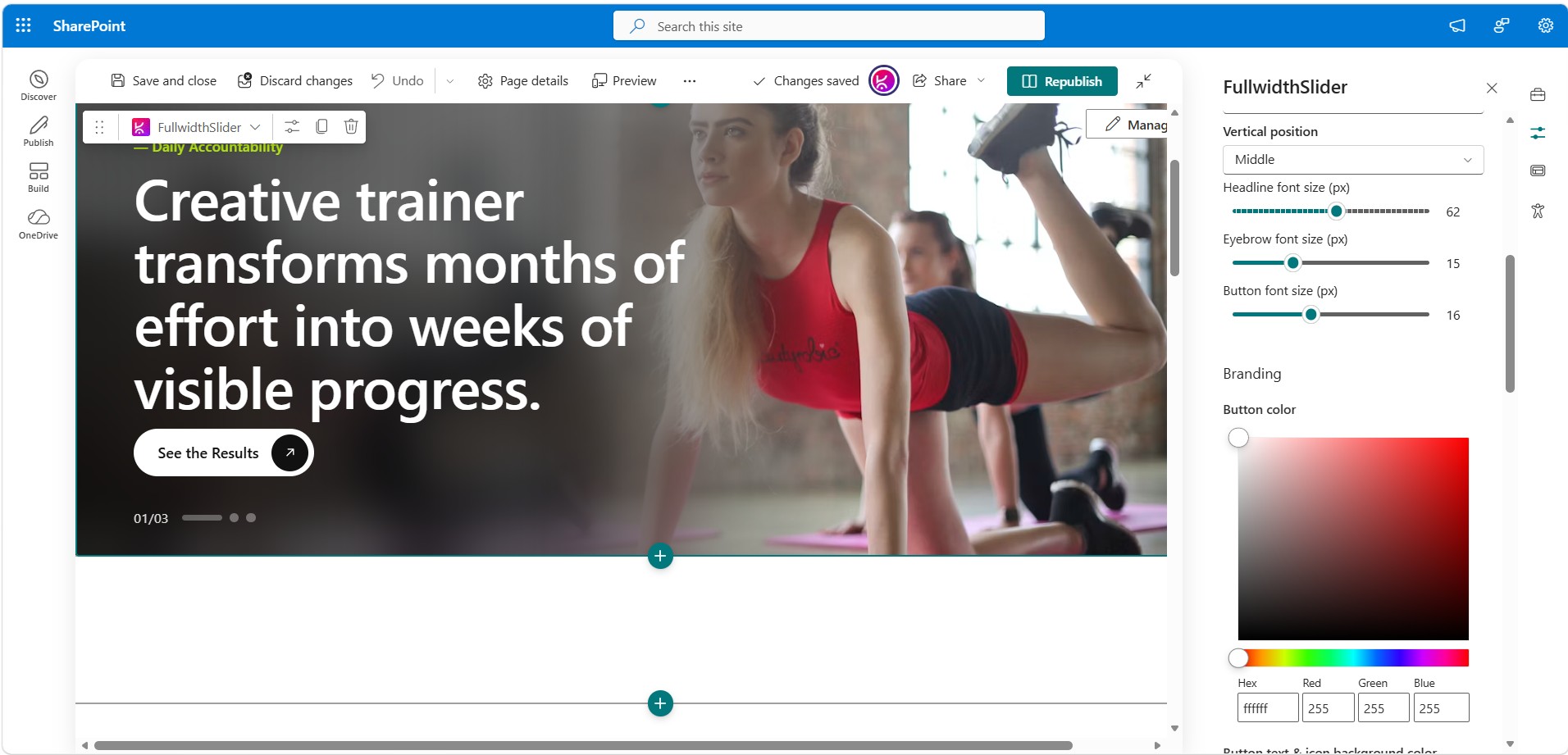
| Headline font size | 24–96px | 62px |
| Eyebrow font size | 11–24px | 15px |
| Button font size | 12–22px | 15px |
Smart shrink-to-fit typography: Font sizes are measured against the actual rendered slide at runtime. Your chosen size displays as-is whenever it fits, and is only scaled down — by the minimum amount necessary — on shorter banners or longer headlines. Text never overlaps the pagination or gets clipped.
Branding Controls
| Setting | Controls |
|---|---|
| Button color | CTA button background |
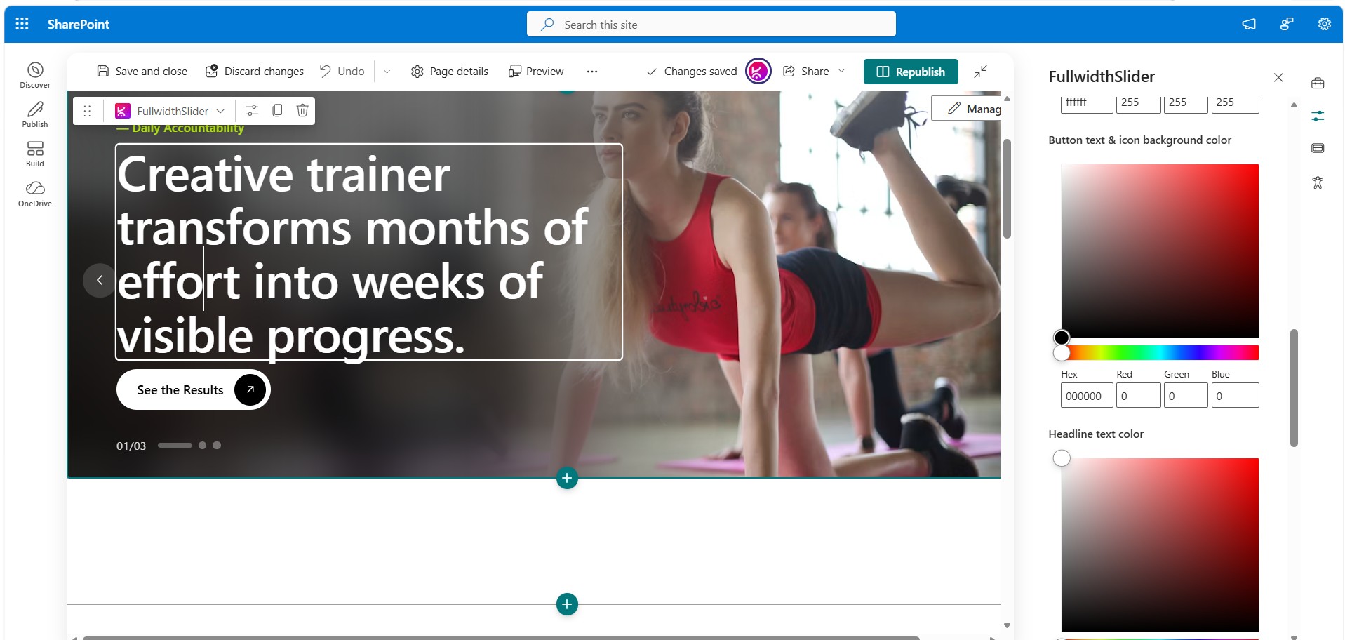
| Button text & icon background color | CTA button text and the circular arrow icon background (colors invert for contrast) |
| Headline text color | Slide headline |
| Eyebrow label color | Slide eyebrow/label text |
| Overlay / scrim color | Base color of the gradient and frosted blur panel behind the text |
| Overlay intensity | 0–100% opacity slider |
Design & Interaction Details
- Full-bleed background image per slide with a frosted, blurred scrim — not a flat gradient — that fades into the sharp photo for a premium hero-banner look
- Smooth horizontal slide transitions with touch-swipe support on mobile
- Pill-shaped CTA button with a circular arrow icon that inverts color relative to the button for contrast
- Counter, animated progress bar, and clickable dot pagination — the progress bar syncs with the auto-play interval
- Hover-reveal previous/next navigation arrows
- Fully responsive: typography and spacing adapt on mobile; arrows hide below 640px width
- Reacts to the SharePoint light/dark theme via CSS custom properties
- Supports full-bleed/full-width section placement and is available as a Teams personal app/tab, in addition to standard SharePoint pages
How Content Editors Use the Slider
- Put the page into Edit mode.
- Click Manage Slides (top-right of the web part) to add, remove, reorder, or edit any slide’s image, eyebrow, headline, or button.
- Or click directly on a slide’s eyebrow/headline text to edit it in place.
- To change an image, use Choose Image / Change Image inside the panel — select Upload for a file from your computer, Site for the current site’s libraries, Organization Assets for the tenant brand library, or paste a link.
- Click Done to close the panel. Changes go live immediately — no separate save step beyond the normal page save/publish.
How Site Owners Configure the Web Part
Open the web part’s property pane to control:
- Layout & behavior — banner height, auto-play, arrows, pagination
- Title & content layout — text alignment, vertical position, font sizes
- Branding — button, text, and overlay colors
These settings apply page-wide to all slides in that web part instance; individual slide content is managed on the canvas as described above.
Frequently Asked Questions
Can content editors update the slider without a developer? Yes. All slide content — images, labels, headlines, and buttons — is managed directly on the page in edit mode, with no code, list, or admin screen required.
Does the Fullwidth Slider support SharePoint dark mode? Yes. Body text and link colors automatically react to the SharePoint theme (light/dark) via CSS custom properties.
Can I use custom images from our brand library? Yes. The built-in image picker supports uploading from your PC, browsing site document libraries, pulling from the Organization Assets Library, or selecting recent tenant files.
Will long headlines break the slide layout? No. The web part’s smart shrink-to-fit feature automatically scales font sizes down — only as much as needed — so text never overlaps the pagination or gets clipped.
Does this web part work in Microsoft Teams? Yes. In addition to SharePoint pages, the Fullwidth Slider is available as a Teams personal app/tab.
Is the slider mobile responsive? Yes. Typography and spacing adapt automatically on narrow viewports, with touch-swipe support and navigation arrows that hide below 640px width for a cleaner mobile experience.
Note: Full-width sections are a standard SharePoint limitation. They are natively supported only on Communication Sites and are not available on Team Sites. This applies to all web parts, including Microsoft’s out-of-the-box web parts and custom-developed ones.
If you are using a Team Site and need a full-width layout, you can download and install our FullWidth extension from here.




There are no reviews yet.