


Description
The Custom Number Counter Web Part for SharePoint Online! This web part allows you to display engaging, animated statistics and key metrics seamlessly on your Communication and Team sites.
Designed with modern aesthetics and robust configuration options, it turns boring numbers into dynamic, attention-grabbing hero elements.
Key Features
- Smooth Count-Up Animations: Bring your data to life! Numbers dynamically count up from zero to their target value over a 2.5 second duration using the reliable
react-countupengine, capturing user attention instantly on scroll. - Dynamic Data Collection: Manage an unlimited quantity of counters within a single web part. Add, remove, edit, and reorder metrics efficiently using the integrated PnP Collection Data property pane.
- Deep Icon Integration:
- Native Fluent UI Icons: Access the massive built-in library of Microsoft Fluent UI icons via an embedded, fully searchable visual Icon Picker.
- Custom Image Support: Prefer your company’s own iconography? Simply paste the URL of any image or SVG graphic.
- Three Premium Layouts: Switch out display paradigms securely in real-time to fit any page section:
- Vertical Stack: Ideal for hero banners and wide columns (Icon rendered on top, massive number centered below, with label text cleanly underneath).
- Horizontal Bar: An inline horizontal spread, optimal for narrow sidebars, minimal footprint strips, and compact data summaries.
- Card / Bordered: Encapsulates each stat in a beautiful, elevated box with subtle hover-lift physics, border radii, and background depths.
- Complete Typography Control: Break free from standard text sizes. Tailor exact pixel sizes for Target Numbers and underlying Labels. Adjust structural font weights (e.g., standard, bold, 600) to lock down your corporate brand guidelines.
- Rich Branding Colors: Paint the web part with your corporate hex codes! Features three independent, real-time Color Pickers:
- Primary/Border Color: Controls the hue of icons, animated numbers, and specific borders.
- Card Background Color: Customizes the background block exclusively on the “Card” layout for striking contrast.
- Label Text Color: Independently drives the descriptive text color separating it clearly from primary stat numbers.
- Inline Prefixes and Suffixes: Seamlessly string together currency symbols (
$,€), standard percentage trackers (%), or custom measurement units (km,hrs) bounding the animating target number.
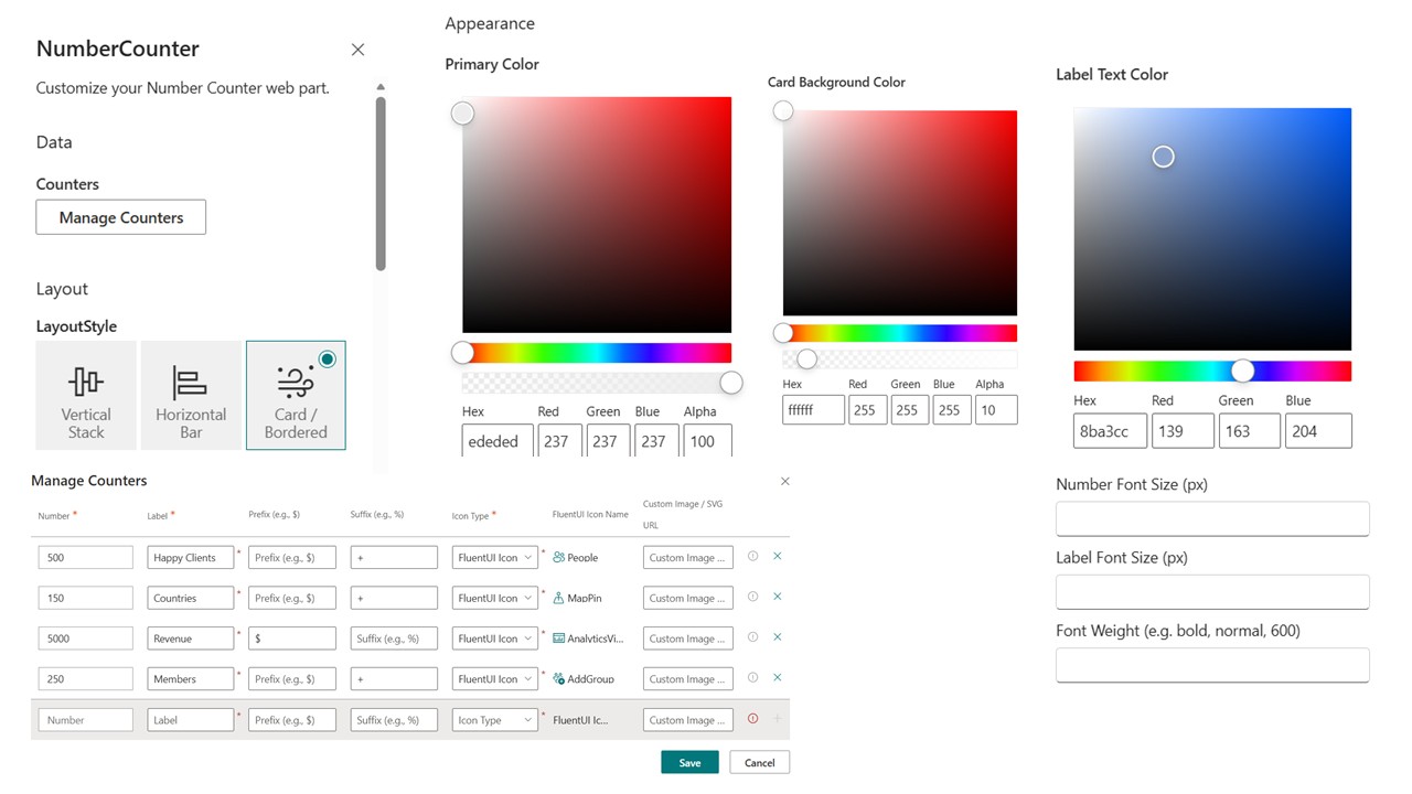
Configuration Guide
Adding and detailing the Web Part is extremely intuitive. Once placed on a surface, hit the Edit (pencil) icon to spawn the Property Pane. You will discover controls strictly grouped into three phases:
1. Data Group
- Counters: Hitting
Manage Counterslaunches the control panel to define the core properties per individual stat (Target Number, Custom Label, inline Prefix/Suffix, Icon switch, and Icon URL/Library Picker).
2. Layout Group
- LayoutStyle: A simple set of visual choices bridging between the
Vertical Stack,Horizontal Bar, orCard / Borderedlayout representations.
3. Appearance Settings
- Primary Color: Pick the master theme tone affecting primary metrics and layout accents.
- Card Background Color: Dedicated color picker for customizing inner backgrounds on the Card view layout for perfect page contrast.
- Label Text Color: Separately adjust the color of the descriptive sub-label text.
- Numeric Size Controls: Define
Number Font Size (px)andLabel Font Size (px). - Font Weights: Scale text boldness.
- Global Animation Switch: Easily pause animations site-wide locking them to full statistical value initially.


There are no reviews yet.