3 minutes read
Modern SharePoint is a powerful platform, but “out-of-the-box” sites often look identical—boxy, restrictive, and clearly recognizable as a document repository rather than a polished corporate website.
The web parts from SharePoint Library specifically target the UI/UX limitations of standard SharePoint. By replacing or augmenting default components with these custom solutions, you can transform a standard intranet into a branded, modern web experience.
Here is a breakdown of how these specific web parts customize your site to look like a “better website.”
1. Breaking the “SharePoint Look” with Custom Headers
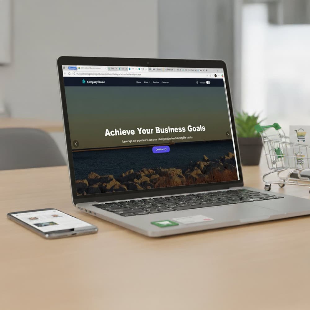
The Problem: Standard SharePoint headers are rigid. You are mostly limited to a small logo, a site title, and a predictable navigation bar. This makes every site look the same and often clashes with strict corporate branding guidelines.
The Solution: SharePoint Custom Header & Navigation Webpart
This web part is likely the most impactful change you can make. It allows you to:
- Remove the Standard Bar: Hide the default top bar that screams “SharePoint.”
- Full Branding Control: Implement a header that matches your public-facing website pixel-for-pixel, using your exact corporate colors, fonts, and logo placement.
- Mega Menus: Create rich, drop-down navigation menus that are easier for users to browse than the default list, improving the “website-like” navigation experience.
2. Creating a “Hero” Experience with Sliders
The Problem: The default “Hero” web part in SharePoint is functional but static. It creates a mosaic of tiles that looks nice but lacks the dynamic, high-end feel of modern landing pages which often use full-width rotating banners.
The Solution: SharePoint SPFx Fullwidth Banner Slider Webpart
This web part brings the “Homepage” feel to your intranet.
- Visual Impact: It spans the entire width of the screen (unlike boxed SharePoint web parts), creating an immersive visual experience.
- Dynamic Storytelling: You can rotate through multiple announcements or campaigns in a single space, keeping the homepage fresh without cluttering it.
- Call to Action (CTA): Professional sliders allow for clear buttons (e.g., “Read More,” “Sign Up”) that drive user engagement, functioning more like a marketing site than a file folder.
3. Organizing Content for Better UX (Tabs & Accordions)
The Problem: SharePoint pages often suffer from the “Scroll of Death.” To show a lot of information (like FAQs, policies, or department services), you have to stack text web parts one after another, making the page extremely long and hard to read.
The Solution: SharePoint Tab SPFx Webpart & SharePoint Accordion SPFx Webpart
These tools introduce modern web design patterns to your content:
- Clean Layouts: Instead of scrolling through 10 pages of text, users can click tabs (e.g., “HR,” “IT,” “Finance”) to switch views instantly without leaving the area.
- ** decluttering:** Accordions allow you to list questions or topics that expand only when clicked. This keeps the page short, clean, and professional—mimicking the behavior of modern support or product pages.
- Information Density: You can present 3x the amount of information in the same amount of screen space, respecting your user’s time and attention.
4. Urgent Communication with Marquees
The Problem: Posting a critical announcement (like “Server Maintenance” or “Office Closure”) in a standard News web part often gets lost among other stories. Standard SharePoint doesn’t have a “breaking news” ticker.
The Solution: SharePoint Notification Marquee Webpart
- Visibility: This adds a scrolling text bar (ticker) typically seen on news sites or stock market dashboards.
- Universal Awareness: It grabs attention immediately at the top of the page for critical alerts without requiring the user to read a full news article.


